
Colour Theory in Getting Dressed: A Plain-Language Introduction
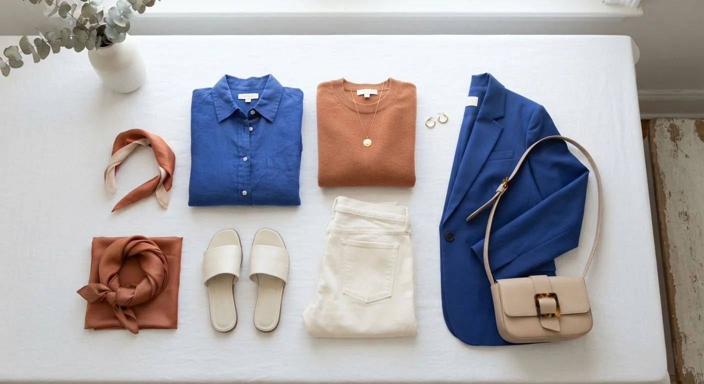
Photo credit: TheBlogZappier.com | Simple Search, Credible Results
In this article
Understand how complementary, neutral, and tonal colour combinations work so you can build outfits with more intention and less guesswork.
Key Takeaways
- Complementary colours sit opposite each other on the colour wheel and create high visual contrast when paired.
- Tonal dressing uses varying shades of a single colour family for a cohesive, low-effort look.
- Neutrals act as anchors, allowing bolder colours to stand out without overwhelming an outfit.
- Understanding colour temperature — warm versus cool — helps you select shades that work together naturally.
- Colour rules are guidelines, not laws; personal preference and context always matter.
Why Colour Theory Matters When Getting Dressed
Most people learn to dress by instinct — grabbing what feels right, avoiding combinations that look 'off', and defaulting to safe choices when unsure. Instinct is useful, but it often leads to a wardrobe stuck in a narrow comfort zone. Colour theory offers a structured vocabulary for what your eye is already responding to, which means fewer second-guesses and more intentional choices.
This is not an art school lecture. The version of colour theory that applies to getting dressed is a small, practical subset of a much larger field — enough to understand why some combinations feel balanced and others feel jarring, and how to use that knowledge when standing in front of your wardrobe. If you are working on building a personal style from scratch, understanding colour relationships is one of the most transferable skills you can develop.
Hue
The pure colour itself — red, blue, yellow — before any lightening, darkening, or dulling is applied.
Value
How light or dark a colour appears on a scale from white to black. Pale pink and deep burgundy are the same hue at different values.
Saturation
How vivid or muted a colour is. A fully saturated red is bright and intense; a desaturated red looks dusty or washed out.
Complementary colours
Two colours that sit directly opposite each other on the colour wheel, producing strong visual contrast when placed together.
Analogous colours
A group of colours that sit next to each other on the colour wheel and naturally harmonise because they share pigment.
Colour temperature
Whether a colour leans warm (reds, oranges, yellows) or cool (blues, greens, purples). Many colours exist in both warm and cool versions.
Tonal dressing
Building an outfit from different shades, tints, or textures within the same colour family rather than mixing distinct hues.
Neutral
A low-saturation colour — typically black, white, grey, beige, navy, or brown — that pairs easily with most other colours.
The Colour Wheel: A Quick Orientation
The colour wheel organises hues in a circle based on how they relate to one another. The twelve-step wheel most commonly used in fashion contexts groups colours into three categories:
- Primary colours: Red, yellow, and blue — the building blocks from which other colours are mixed.
- Secondary colours: Orange, green, and violet — produced by mixing two primaries.
- Tertiary colours: The six in-between shades, such as red-orange or blue-green, formed by mixing a primary with an adjacent secondary.
Beyond hue, two other concepts matter for dressing: value (how light or dark a colour is) and saturation (how vivid or muted it appears). A dusty sage and a bright emerald are both green, but their value and saturation differ significantly — and that difference determines how they behave in an outfit.
Colour temperature is also worth noting. Warm colours (reds, oranges, yellows) tend to visually advance and feel energetic. Cool colours (blues, greens, purples) tend to recede and feel calmer. Most colour families contain both warm and cool versions — a blue can lean towards purple (cool) or towards teal (still cool, but with more warmth).
Three Colour Combinations Worth Knowing
From the wheel, a handful of combination strategies are consistently useful for outfit building:
Complementary
Complementary colours sit directly opposite each other on the wheel — cobalt blue and burnt orange, for example, or deep violet and mustard yellow. These pairings create maximum contrast and visual energy. In practice, they work best when one colour dominates and the other appears as an accent, otherwise the effect can feel overwhelming.
Analogous
Analogous colours sit adjacent to each other on the wheel, such as teal, blue, and indigo. Because they share underlying pigments, they feel naturally harmonious. This approach is forgiving and produces outfits that read as cohesive without much effort. It is the quiet logic behind many tonal looks.
Triadic
A triadic scheme uses three colours evenly spaced around the wheel — red, yellow, and blue being the most primary example. This is the boldest approach and requires more confidence to balance. Keeping two colours at a lower saturation while letting the third lead tends to make it more wearable. See how maximalist dressing often draws on exactly this kind of multi-colour tension.
Start With One Accent Colour
If complementary or triadic schemes feel daunting, begin by introducing a single accent colour into an otherwise neutral outfit. One coloured accessory or layering piece gives you a feel for how contrast works without committing the whole look to a bold combination. Once that feels natural, you can scale up.
Neutrals: The Connective Tissue of Any Wardrobe
Neutrals — black, white, grey, navy, beige, camel, and brown — function as the connective tissue of most wardrobes because they carry minimal colour identity of their own and therefore rarely clash. They lower the visual stakes of an outfit, allowing a single coloured piece to stand out clearly.
A practical way to think about neutrals: they are the background against which colour reads. A terracotta blouse looks quite different against white trousers versus camel trousers versus dark grey trousers — the neutral you choose changes the perceived warmth and intensity of the colour alongside it. This is why the foundational wardrobe pieces most style frameworks recommend tend to be neutral — they multiply your options without adding colour complexity.
Not all neutrals are the same temperature. Black and cool grey lean cool; camel, cream, and brown lean warm. Mixing neutrals of different temperatures can occasionally feel slightly discordant, though this is subtle and highly personal.
Watch for Conflicting Undertones in Neutrals
Mixing a cool-toned black with a warm-toned off-white or brown can sometimes produce an unintentional clash — not because of the hues themselves, but because their underlying temperatures pull in opposite directions. This is subtle and not a hard rule, but if a combination feels slightly 'off' despite using only neutrals, undertone conflict is often the cause. Try swapping one piece for a neutral that matches the temperature of the other.
Putting It Into Practice
Colour theory becomes useful when it reduces decision fatigue rather than adding to it. A few starting points:
- Audit what you already own. Lay out your clothing and note which colours dominate. Most people find they default to one or two colour families without realising it.
- Identify your neutrals. These are the pieces you reach for most often as the base of an outfit. Note their temperature — warm or cool — and look for consistency.
- Introduce one complementary accent. If your wardrobe skews blue-green, a single warm rust or amber piece will create contrast without disrupting everything else.
- Try tonal layering. Wearing different shades of the same colour family is one of the lowest-risk ways to move beyond all-neutral dressing. Layering effectively also involves considering fabric weight and proportion, which compounds well with tonal colour strategy.
Colour forecasting — the industry process of deciding which shades are prominent each season — can offer inspiration, but it is not prescriptive. How seasonal colour trends are decided is an interesting area to understand, particularly if you want to shop with more awareness of which shades have genuine longevity versus which are short-lived trend cycles.
Ultimately, colour is a tool. The goal is not to follow rules precisely but to understand why certain combinations feel the way they do — so that when you break the rules, you are doing it on purpose.
Frequently Asked Questions

Author
Style & Beauty Editorial Team
Style & Beauty Editorial Team is the collective byline for our editorial team and contributor network. Articles published under this byline or an editorial pen name are researched, written, and reviewed according to our editorial standards for clarity, consistency, and independence before publication.
View all articles →